User and Set-up Guides
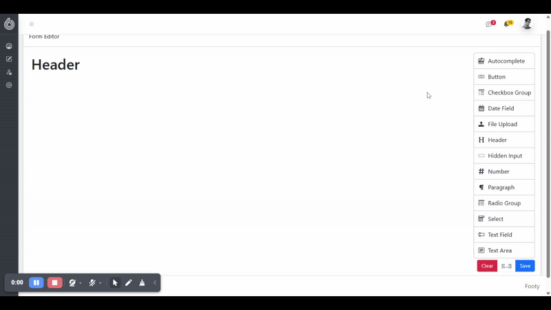
How To Build Your Web Form
Build secure, GDPR-compliant forms in minutes, with no coding needed. Our drag-and-drop form builder makes it easy to create and customise secure webforms.
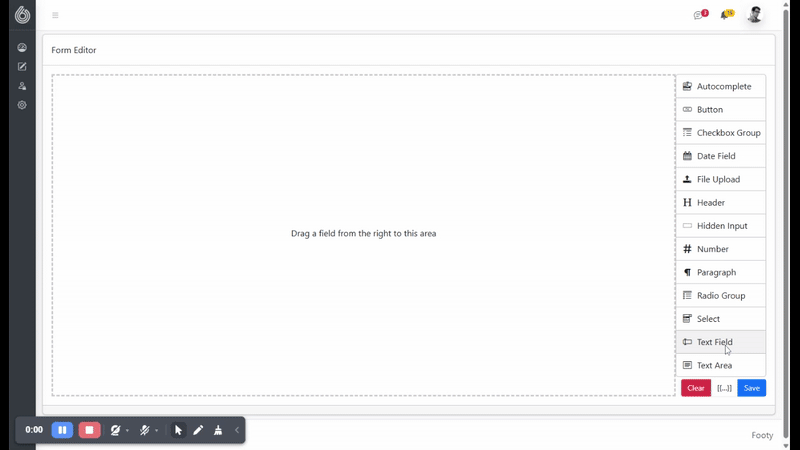
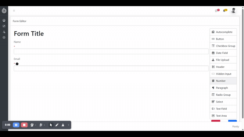
Adding Fields:
Select the fields from the menu and drag and drop them onto your form.
💡 Tip: Use the Text Field to add the different elements to your form e.g. Name, Email, Phone, etc. Use the Paragraph field for large text areas, like comments, address, etc.
Click the ‘Edit icon’ to customise; edit Label to rename the field, add a Tootltip, add placeholder text and make the field required.
💡 Tip: Add a Title to your form first.
🔽 Click to open “How to add a Title to your form”
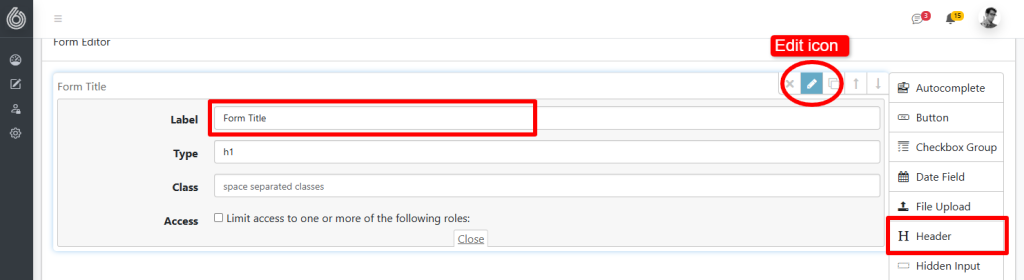
Click Title field and drag it to the form
Click the Edit icon, enter a title for your form in the Label field. You can select the size displayed on your form, H1 to H6 (sizes are fixed in your form’s Style settings).
💡Tip: Use H1 for your form’s title at the top, then select H2 sub-titles or section titles throughout your form.
Adding Buttons:
Once you have finished adding all the fields to your form you need to add a submit button.
Drag and drop the Button field onto your form. Change the Label to whatever you’d like your button to say and change the Type to Submit. You can also create a Reset button, which when clicked removes the data entered in all fields, by selecting Reset in Type.
Change the button colour by selecting Style.
Form Builder Fields:
- Button
A button is an interactive element that allows users to trigger an action. Buttons are used to submit form data or reset form fields. - Checkbox Group
A checkbox in a web form is an interactive element that allows users to select one or more options from a list of choices. - Date Field
The Date field allows users to type in a date or select it from a pop-up calendar. - File Upload
The file upload field allows users to attach files (like documents, images, or videos) to their form submission, from their device. This functionality is crucial for many online forms, allowing users to provide supporting documentation or content alongside their other form data. - Header
The Header field is a non-input element used to display text that serves as a title or introduction to your form or a section. - Hidden Input
Also known as a hidden field, is used to include data that isn’t intended to be modifiable or viewable by the user who submits the form. - Number
The Number field validates that only a number can been entered, it does not allow non-numeric characters to be typed in. - Radio Group
The Radio Group field forces a user to select only one option from a predefined list of choices. It is used for questions where a single, definitive answer is required, ensuring clear and accurate form submissions. - Select
The Select field allows users to choose one option from a ready-made drop-down list. - Text Field
The Text Field is a single-line input box that allows users to enter letters, numbers, and symbols into your form. It is the fundamental form element that presents a rectangular input box. - Text Area
The Text Area field allows users to input longer, multi-line text responses, unlike the single-line Text field. This field provides a larger text area for addresses, detailed feedback, descriptions, or complex requests.
Field Settings:
- Required
Ticking ‘Required’ forces people to enter details in to a field. The form will not submit unless all ‘required’ fields have been completed. - Label
Is the title name of the field, visible to the user. - Help Text
This adds a Tooltip to the field, a brief, informative message also know as an infotip or hint. - Placeholder
A placeholder is short, descriptive text that appears inside the field to guide the user on what type of information to enter. It disappears when the user starts typing into the field. - Name
If required, you can add a name to the field, hidden from your users, different to the Label. This is only visible in the form submission. - Value
This is default data entered in the field and passed with the submission. - Type
Change a Text Field to accept only email addresses, password (starred out) or select tel for phone numbers. - Max Length
Sets the maximum amount of characters allowed in the field.